
Let’s start with the basics here, what actually is a landing page on a website? Well, a landing page is basically a URL on your site that people land on with the hopes of taking a specific action on that page. Said action may be something like:
- Buying a product
- Signing up for a Trial
- Subscribing to the Newsletter
- Booking a consultation
And the list goes on and on. To clarify right from the start, a homepage and a landing page are NOT one and the same thing.
Sure, you might use your homepage as a landing page (not recommended for many reasons), but generally landing pages are crafted with very specific audiences and goals in mind, that a homepage is just too generic for.
Ok, we’ve gotten that out of the way, so let’s just talk about what makes a good landing page. If you’re not familiar with Neil Patel, go make yourself familiar with him this instant. He’s been in the SEO and Digital Marketing scene forever, and in my opinion, produces some of the best paid and free content out there for anyone looking to improve in this area of their business.
No, myself and the SpinLab were not in any way approached by him to write this article, he’s just that good. Period.
He recently launched a new product called Agency Unlocked, his first paid product of this sort. I am subscribed to his newsletter, so I got the email notification about the product which took me to one of his landing pages.
The landing page was so expertly crafted, I decided to dissect it, and talk about how startups should follow his model. To get the most out of the experience, I’d recommend you open up the landing page itself, and follow along in the video while reading this article.
10 things that make Neil Patel’s latest landing page so effective
1. It locks you into the page
Not literally, but pretty close. What I mean here is the only real opportunities to leave this page to go somewhere else on the web is to either click one of probably legally required links at the bottom for the disclaimer or the privacy policy, OR to physically close your browser, use the back button, etc.
Even the video itself is not a YouTube embed, in fact, all the user can do here is play and pause the video. Nothing more.
That’s crucial because remember, the main goal of a landing page is to get the visitor to DO something. So why give the user so many extra opportunities to leave the site you’re sending them to?
This is especially true with paid ads, because remember, you’re paying for every single ad click, so why let that user be distracted with links to your homepage or other irrelevant articles?
Minimize the fuss and the noise, and the keep the user’s engagement and focus where you intend it to be.
2. The value proposition is completely clear
I see way too many startups get lost in their buzz words and tech specs that they just have no chance at explaining what they do to a normal person in a way that is understandable.
That’s problematic, and this problem almost always trickles down into their website wording. They try to launch campaigns and you get to their site and you’re just left with a feeling of, I have no idea WTF it is that these guys do.
Look at the top half of Neil’s page here:
 A crystal clear description on what this page is going to do
It doesn’t get any clearer than that. Within two seconds we have an awesome value proposition that answers the question, what is the user going to get? Well, they are going to get information that is going to help them double their site traffic. Is that relevant for the target audience? Absolutely.
Secondly we quantify that with time. 2019 is a time of results here and now, because apparently ain’t nobody got time for patience! So right after the value proposition, we know how long it will take before I can receive benefits from that value, and the answer is five days or less.
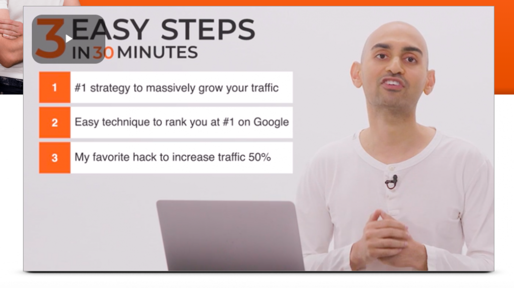
3. The page stays consistent with addressing the audiences goals and time
If you’re going to hit people with a 30 minute video, you gotta make that video digestible. You’ve gotta keep re-engaging your audience with themes so they don’t lose interest and go start watching epic rap battles of history videos (though personally I can almost always recommend watching epic rap battles of history videos). This theme stays constant throughout the video, so that as a visitor, you consistently keep knowing what you’re getting into.
First and foremost, Neil if you ever read this I am sorry for the horrible expressions on your face in these screenshots, but trying to time them with only pause and play functionality proved…difficult haha.
But again here we have three easy steps, three easily digestible end results that prove value to the audience, and a time frame. All objects mentioned here can be accomplished within 30 minutes or less. Boom.
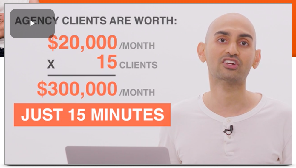
4. It proactively addresses objections
Remember, most of the people who land on your landing pages are not going to buy. That’s just the way it is, and as marketers we can be happy if we have a conversion rate of 10% on a page. That means 90% of the people who touch that page are not going to perform the desired action!
So why not do everything in our power to handle all customer objections beforehand? If you’ve done your research and you know what makes your personas tick, you should know what their common pain points and objects are.
So in one part of the video Neil states that there are some simple changes that marketers can make to their site that can get them some seriously awesome results.
Neil knows that his persona of focus here is a marketer type, and he’s obviously done his research because as soon as he pitches those site changes, he immediately brings up a caption that says these features / tools can be added to a site within 15 minutes, without a programmer, without coding knowledge, and completely for free.
Just like that, Neil took away any objections a typical marketer could have:
- I’m a marketer, I have no idea what coding is
- Ugh I hate going to talk to dev about this stuff, they always think my marketing stuff is just a waste of time
- I don’t have extra time to learn anything new to implement new features on the site
- I don’t have any extra budget to devote to new and untested marketing initiatives right now
With just one simple caption in the video, and some reassuring words from him, all is well again in the world.
5. Visuals that the persona understands
When showing the results he can generate with website traffic, he uses graphs from interfaces that are well known to his personas. To marketers, the terms SEMRush and Ahrefs are not strangers, we use these tools day in and day out, and we can instantly recognize what is happening here. And he uses that to his advantage, he shows graphs produced by these tools to show how quickly results can be gained (props for the hockey stick)!
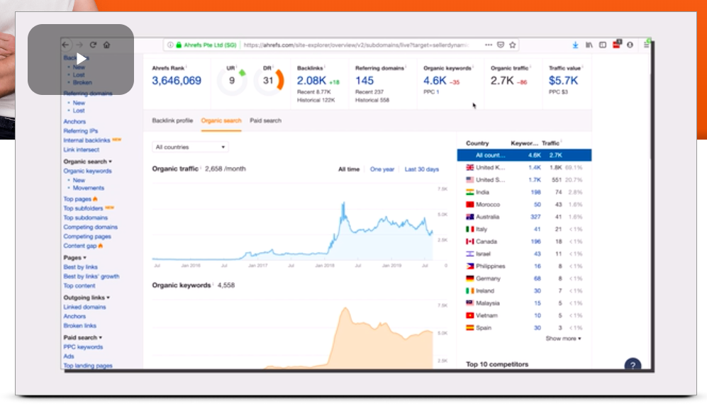 An SEMRush Visual every marketer is looking to get
If you can, use visuals that your persons will understand and are already familiar with. Confusing graphs and excel tables, or proprietary visuals that your software or product produces aren’t relevant here yet. Your audience doesn’t know what to do with that info yet, that comes later in the customer journey.
6. Prove effectiveness that challenges the status quo
For old school digital marketers and SEOs, we know that Google Authority and Backlinks are two of the most prominent factors in getting a site to perform well in the organic search arena. At some point in the video Neil specifically calls out these two elements, and shows that the results he’s delivering happened even without prominent Google Authority or a lot of backlinks.
7. He translates metric fluff into the bottom line
And the end of the day, what is most important to marketers is how much our campaigns generated and how much money we can save in other areas of the marketing picture.
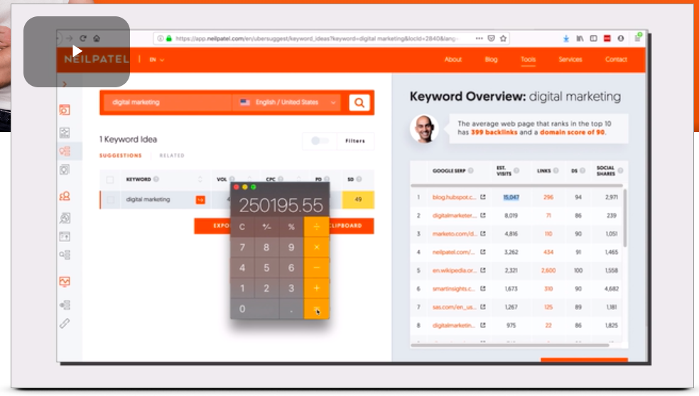 That's a lotta savings!
In one of Neil’s examples, he overtakes HubSpot for the number one organic rank for the term “digital marketing.” Sure, that’s awesome and all, but what does that actually mean? In 30 seconds he explains how simply by taking over that number one spot, he potentially saved over $250,000 dollars in paid advertising. He even goes one step further and shows what that potential metric increase could turn into for earnings for his own business:
So yeah, 15 minutes of work for THAT kinda result? That’s a pretty solid return on investment I’d say.
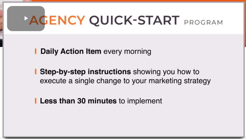
8. It’s beautifully focused
Towards the end of the video where Neil actually pitches his new product, he doesn’t throw out vague benefits such as “will help your business grow fast” or “will improve your customer conversion rate” he drops the hammer and says out right:
- You’re gonna get a daily action item every single morning
- You’re gonna get step by step instructions on how to execute a single change to your marketing strategy
- It will take less than 30 minutes to implement (again reinforcing the time aspect)
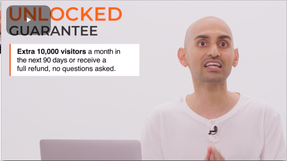
9. It eliminates all risk for the visitor
This is something I’d love to see more and more of in Germany and the EU as a whole, product offerings so rock solid that the company is willing to assume all risk and completely refund the cost of the item if the product doesn’t deliver on its promise.
That my friends is putting the customer first. Besides, if your product delivers on what you claim it does, everybody wins in the end.
10. The call to action (CTA) button comes at the very end
This was a nice little touch here, because in a way it forces the viewer to watch the video in its entirety. The video was well made, and you can tell it took some resources from Neil’s team to produce that kinda quality, so it makes sense to have the CTA button hidden until the end.
The viewer gets a ton of usable information from the video, and if they stick around til the end to completely view a piece of content that demanding, the chances of them clicking on the CTA and engaging the offer are MUCH higher.
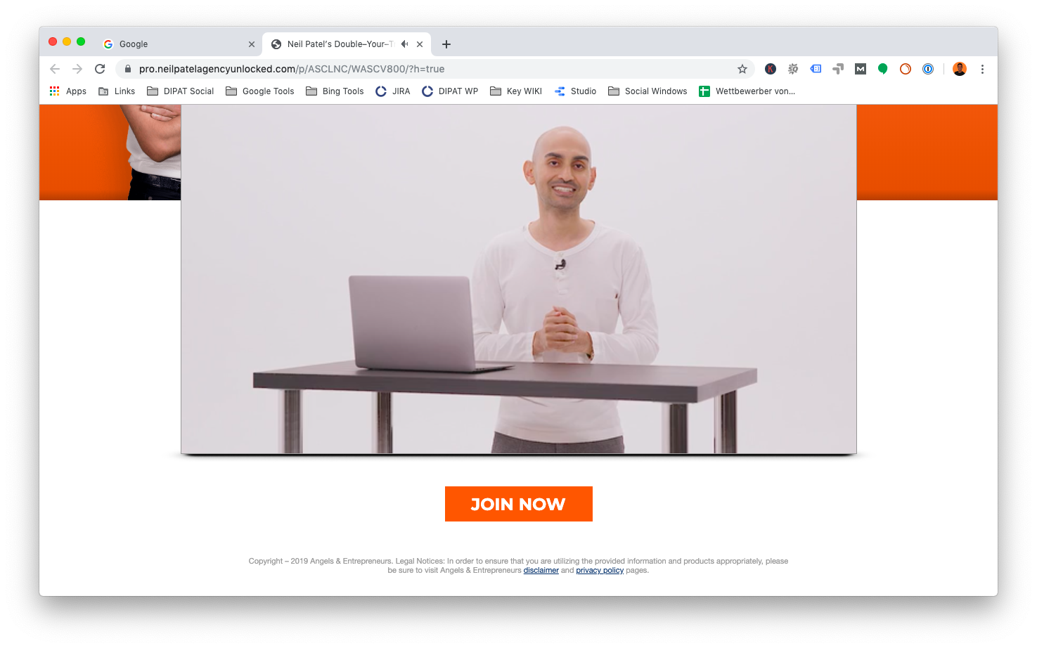 CTA at the end
We’ve all been there before, no time, in a rush, get to an interesting landing page and we just skim over it and get to the part that says order now. We click on it and we’re immediately turned off by price, shipping time, whatever.
But here, if you’ve watched that entire video, you know exactly what you’re getting into by the time you click on that CTA, and there are no surprises. On the flip side, Neil has filtered out all potential bad prospects, because if they were too uninterested in the video to make it to the end, they probably were not the right fit for the product anyways.
What takeaways did you gain to improve your startup’s landing page strategy?
I truly nerded out on this landing page, but that’s because as a marketer, I truly find it to be a masterpiece, created by one of the best players in the game.
I know I am going to be implementing these three tactics into the SpinLab’s site as soon as possible, and who knows, maybe in the near future a review on Agency Unlocked will be on the horizon :-)
What takeaways did you get from Neil? What are you going to implement into your startup’s online marketing strategy? Let us know in the comments, and til then, happy marketing!


/White%20Versions/stadt_leipzig_white.png?width=130&name=stadt_leipzig_white.png)
/lfca_white.png?width=119&name=lfca_white.png)

/White%20Versions/sachsen_signet_white.png?width=65&height=79&name=sachsen_signet_white.png)