
We’ve seen a lot of startups come through our startup accelerator's doors, and make no mistake about it, new founders have a lot to do. In fact, they have a ton to do, and there’s normally not enough hours in the day for them to accomplish all of their daily tasks.
This is the reality of a new founder in 2019, but the other side of that reality is that, certain tasks, which are just as important, tend to not get as much attention and love as they should. My main gripe here, startup logos.
It’s really perplexing to us here at the SpinLab, because the logo dates back to being one of the oldest forms of marketing. I mean think about it, before we were even thinking about selling stuff for money, we were selling ideas to win people over. Look at every major religion, club, influential family, or organization in the old world, each and every single one of them had some kind of symbol representing their cause, and the same holds exactly true for a company’s logo. The logo is your brand, and more importantly, it is your company’s soul. It will give the first impression of your company many times, and therefore it should be as perfect as it can possibly be, every single time it is presented.
The logo is your brand, and more importantly, it is your company’s soul.
The Apple with the bite out of it, the swoosh on the side of so many shoes, the blue and white propeller on the hood of so many famed German cars, all iconic logos known throughout the world. But all of that had to start somewhere. None of those companies were big as soon as they launched, but we all still know their logos today.
This is why it blows my mind, that I receive so many poor quality logos from startup founders in this day and age. That symbol, is worth so much more than you can imagine.
Your startup’s logo doesn’t have to be designed perfectly on the first try, but it does need to be presented perfectly over time.
Let me be clear here, I am not saying that all founders need to be so laser focused on the design of their logo, they just need to make sure that when their logo is being presented, it is done in the best way possible. There’s not a single logo out there, that was perfect on its first render, if you don’t believe me, take a look at this great article showing the evolution of Airbnb.
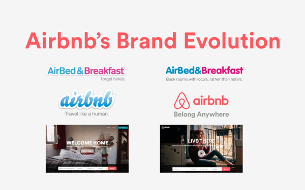 Image Credit: all-about-airbnb.com
This is one of my favorite examples of how a logo started off ugly, but evolved it self alongside the product, and reached greatness. Now most people in the modern digital world immediately recognize that sleek current logo that they have. You’re allowed to redesign your logo and re-brand your company as needed, and as things change, but again, all I am saying is, you’ve got to present your logos correctly when you share it. So without further ado:
Here’s 6 ways to make sure your logo is always being presented properly
1. If you can, design your logo in house.
This may not be a solution for everyone, as maybe some of you don’t yet have an art person onboard, and perhaps your art skills are, well…lacking. The main thing here is accessibility, I’ve run into countless startups who have hired someone to develop their logo, and they are delivered a .png of the finished logo, and that designer is then long gone. Sometimes these founders can’t even find the designer again later, or lose contact completely, and they’re stuck with a file they cannot modify. This sucks. So if you can’t develop a Logo in house, make sure you get an editable file as part of the finished product, BEFORE you end the working agreement. A editable file simply means something that you, or someone else, can open up with an art program and make major edits to.
2. Develop your logo using VECTOR art
This drives print-minded people insane. As an entrepreneur you MUST know what vector art is, it is worldwide industry standard to have any type of branded imagery or art for a company in vector art. If your company’s collaterals are not vector art, you will give off a very amateurish "I don’t know what I’m doing" kinda vibe.
The industry standard for developing and designing logos is Adobe Illustrator, and thus your logos should be developed natively in this program . Unfortunately this program typically costs a lot of money (unless you're eligible for an education discount), so for those of you still boot-strapping, there are some free versions out there.
*A recommendation on a free vector art program*
I'm fortunate enough to be versed in Adobe Illustrator, and I've been using it forever. As mentioned, it is the most widely used program for logo creation in the world, and will likely be staying that way for a long time. For those tight on money, I personally like using Gravit Designer. It's a free design program that can render vector art, and they also offer a web-based version. I mean hey, sometimes it is nice to not have to download more stuff to your computer. While by no means a replacement for Illustrator, it can be a good option in the beginning, and in my tests vector images rendered here are easily editable within illustrator itself.
3. Actually know the difference between vector art and pixel art
I have exchanged many emails with new founders explaining to them that their files are not vector art, and that they need to give me a vector art image before I send it to our printer to have their signs for their companies printed out. Normally, all they do is take a low resolution image, dump it into Adobe Illustrator (or something similar) and re-save it as an .ai or .eps file. This is an epic fail, and does not give you a vector image. All it did was change the file extension of your already low quality image. FAIL.
So how does one tell the difference between Vector and Pixel art?
It’s simple really, vector art is made with a file format that scales indefinitely. Meaning it can be printed on a business card, or on the side of a building, and the file will always scale and stay sharp and crisp on every corner and every edge. Pixel art, on the other hand, is what cameras do. They essentially render a photo or design using millions of small squares of different colors and shades called “pixels” to give the eye the image that you’re seeing. If you scale these, at some point you’ll see the image degrade.
Luckily, this is very easy to test yourself. If you have no idea if your logo is vector art or not, simply open it, and start zooming in. The instant you see image degradation, you’ll know you do not have a vector art logo or image. See the images below for comparison.
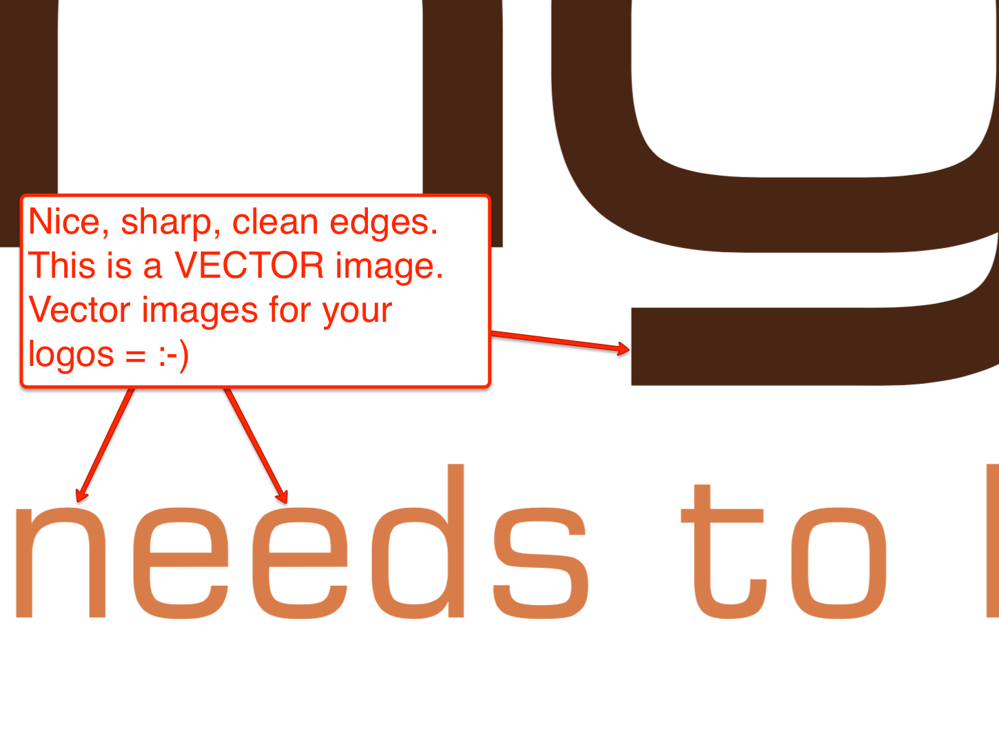 A vector example, notice how every edge stays sharp.
4. Have appropriate file types for different people
Print and web people have very different needs in life. If you’re sending your logo to someone who is going to be doing something with a website, chances are they will want a vector version of your logo that is saved as a .svg with a RGB color profile. If you’re sending your logo to someone who needs to print it, that person is likely going to need an .ai or .eps file type saved with a CMYK color profile. The details of those to profiles go beyond the scope of this article, but long story short, if you’re hiring someone to do your logo, make sure they provide you with two types meeting the criteria I just specified.
A small side note, a lot of the free vector programs out there cannot generate .ai's or .eps's. Gravit Design is one of those examples, if you're using a free version, an .svg is still better than a low resolution pixel file.
Once you have the two logo types, make sure to send the right logo type to the right person, depending on the need.
SVG to Web People AI/EPS to Print People.
5. Do not save your logo with excess white space around it
This also drives print people insane, when we get a file that has a logo that measures perhaps 2cm x 4cm, surrounded by 100cm of white space all around it for no reason. This creates unnecessary work when your logo is being placed on collateral along side many other elements. Get rid of that extra white space, and save your file with the minimal amount of space around it that you can.
 How to save your logo, nice and tight to the edges. No extra white space without reason in the file.
6. Do not send your logo with fonts in it
This is another serious no-no. Have you ever gotten a Powerpoint Presentation from someone, only to discover that the presentation looks like absolute garbage on your computer? A likely cause of this is that you don't have the font on your computer that the original creator of the Powerpoint used. This is why we always recommend creating pitch decks as a PDF, but the same rules with fonts applies to logos - If you send someone a logo that has weird fonts in it, it will not look the same on your computer as it does in theirs if they do not have that same weird font!
Let me be perfectly clear here:
- Keep fonts on the logo that is saved on YOUR computer. This will allow you to type easy edits and make changes, etc.
- But when you're sending the logo to someone, those fonts need to be converted into shapes!
Converting fonts into shapes means just that, when they're created as shapes, computers no longer see fonts such as Arial or Helevetica anymore, they just seen a bunch of data the happens to be in the shape of a certain letter or word.
The easiest way to tell if something is still a font, is the infamous cursor is still blinking between the letters. So to summarize, whatever program you're using, be sure to figure out how to convert any text you have integrated into shapes.
Seriously, your logo is your first foot forward. It should be powerful and it should represent you well
We hope we’ve helped you understand some better ins and outs of giving your logo to people. Again, the design doesn’t have to be perfect the first time around, but it should be presented perfectly, each and every time.
We hope you enjoyed this article, what do you love or hate about logos? Let us know in the comments below!


/White%20Versions/stadt_leipzig_white.png?width=130&name=stadt_leipzig_white.png)
/lfca_white.png?width=119&name=lfca_white.png)

/White%20Versions/sachsen_signet_white.png?width=65&height=79&name=sachsen_signet_white.png)