

Successfully running a startup accelerator can be tricky business as there are typically a myriad of things we are trying to accomplish all at once. But developing a good startup logo should not be something that provides too many challenges for a young company.
Our topic of the week lies with proper startup logo design. It’s a thing that every startup is going to have to go through, but sadly it is something that also typically gets overlooked, and doesn’t get as much love as it should.
This is really unfortunate, because after all, your company’s logo can be the first impression left on a person.
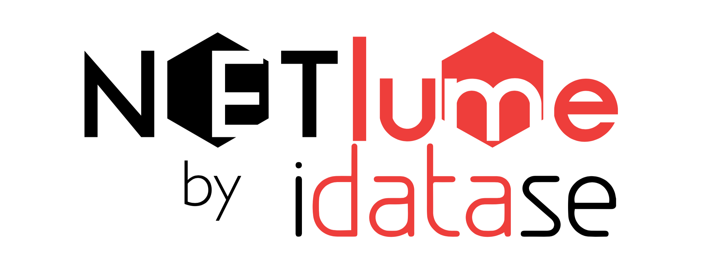
A startup in one of our previous classes called idatase has developed a product called Netlume. Netlume is a software solution the enables companies to fail fast and efficiently, so decision makers can quickly asses all weak points in their solutions and address them accordingly before too much money and time is wasted.
This is some serious innovation happening, but sadly their logo was leaving a lot to be desired.
They were brave enough to let me dissect their logo for the purpose of this article in order to help the greater good of all startups, and I look forward to see how they’ll move forward with their branding in the future. So to start, let’s take a look at their current logo:
And without further ado, shall we begin?
6 Tips for successfully designing your first startup logo
1 - Design in black and white first. Add color LATER.
Designing good startup logos begins with structure first. Colors are a detail that comes later in the process. So if you’re going to take on designing your logo yourself, do so, and finish it in black and white first.
The reason for this, is because if it can stand on its own in black and white, it can stand well when a color scheme is added. This does not work the other way around.
Don’t believe me? Then let me give you a scenario:
Imagine you’re doing good with your startup, and you’ve designed it using 4 different shades of yellow. You get invited to a prominent trade show where your startup will be featured on print materials and logo walls all around the event and the graphic boss of the event tells you that your logo is going to be placed only against white backgrounds.
Yep, now you’re screwed. You ever try to see light yellow shades on a white background from afar? It doesn’t work too well.
That’s exactly the point here, if your logo stands well in black and white, it means you can also knock it back to a single color depending on the use it is going to have.
“If it can stand on its own in black and white, it can stand well when a color scheme is added.”
Verdict on Netlume Logo: 8/10
The logo doesn’t actually do too bad here. Since it only is two colors, I can imagine that taking it into all black or all white would not harm the integrity of its design.
SpinLab insider tip - color psychology
When you’re ready to add color to your logo design, it can have a tremendous psychological impact on how your brand is perceived. We recommend checking out this guide to review what color means on some worldwide known brand-logos.
2 - View your logo from afar to see how it stands in different sizes
I’ve met a lot of people who have had some pretty cluttered logos, and that is because they design it the entire time on their monitor using 120% zoom, which in turn creates a false positive.
Take a step back, zoom out, and see how your logo functions once it is small…Need a perfect example?
A BUSINESS CARD! This is likely the smallest your logo will ever be presented, so you need to insure that the logo is legible at this size, and doesn’t take up too much space on the card that you cannot add important company information!
Verdict on Netlume Logo: 4/10
Here the logo suffers quite a lot. I tried my hardest to get the digital display of my monitor to true business card size, where a lot of the logo just gets lost at this size.
The red parts become almost unreadable, and the actual company name gets kind of lost as well. It could work if you made the logo bigger on the card, but then you’re losing space for contact information.
3 - In 2020, square-based logos are the standard
In my opinion, this was always the case as it is typically easier to incorporate quadratic designs into other design elements as opposed to a rectangular design. But the game changer that startups need to pay attention to nowadays is social media.
/Screen%20Shot%202021-01-04%20at%2013.48.23.png?quality=low&width=600&name=Screen%20Shot%202021-01-04%20at%2013.48.23.png) If you're logo doesn't fit in a square, you'll have consistency issues on various platforms such as social media.
If you're logo doesn't fit in a square, you'll have consistency issues on various platforms such as social media.
Yeah, all those areas to upload a fancy photo for your company pages (which 100% should be your company’s logo and nothing else) are all S-Q-U-A-R-E-S! So to make as much of that space as possible, and to be easily recognizable for your audience, go with a square-based design.
Verdict on Netlume Logo: 4/10
The logo suffers here as well as it is predominantly rectangular.
SpinLab insider tip - logo variations
The actual SpinLab Logo is actually also horrible for social use as we have a distinctly rectangular logo, the solution I found for this was simply to designate the cotton ball to the left as our “secondary logo” so this is what shows on all of our social profiles. It’s ok to have a secondary logo for your brand, but it must definitely reinforce the main logo, not be a completely second entity!
The SpinLab cotton ball is a perfect example of this, as it is a direct part of the main logo. But could you imagine if Nike suddenly said, “Ok from now on our secondary Logo is going to be star with 16 points.”
This would not work at all, because the continuity of the logo and brand would be lost.
4 - Your logo should tell a story
To be clear from the very start on this point, your logo should not try to explain your brand’s entire identity, how the team met, what the market looks like, how many lines of code are in the product, etc.
That would be way too much work, and would likely result in you having a logo that is just cluttered and not very pretty.
What you ABSOLUTELY SHOULD do, is try to incorporate some kind of story in your logo that pays respect to the problem you’re trying to solve and/or the company’s history. Below are some of my favorite examples from global brands:
- The famous NIKE Swoosh represents Nike, the Goddess of Victory in Greek Mythology. A perfect match considering what the brand creates, but the swoosh itself is symbolic of one the motions and sounds the Goddess’s wings would make, which represent speed.
- BMW’s iconic blue and white circle is recognized around the world as a symbol of engineering marvel, but what actually are those blue and white quarters within the circle? They actually represent an airplane propeller in motion, which pays homage to the company’s roots in aviation.
- Amazon’s famous smile at the bottom of their logo is pretty easy to recognize, as it represents their devotion to customer satisfaction. But did you know that the arrow that represents the smile is actually connecting the letters A and Z? This is a mention to Amazon’s commitment to offering a marketplace that offers everything from A to Z.
So give it some thought, because if you manage to reach that infamous unicorn status, you want to have something better to say than “Oh it looked cool” when asked about the meaning of your logo. The best startup logos out there do a great job of telling their company's story.
Verdict on Netlume Logo 7/10
According to the founders, the various hexagons represent the internal system for the product their developing, so in their case the story is actually completely present.
5 - Think ahead when including words in your logo
Unnecessary words should absolutely be left out of your logo. They take up space, and just make the logo look more cluttered.
Things like the company name can, and from the beginning, should, be included in logo design. But think about how the logo stands when you pull that away, can it survive?
Apple, Nike, Starbucks, and many others have all evolved their logos to now stand alone without the brand name, can yours do the same?
Granted these are industry giants, but on a more feasible note, having too much text on your logo can make it very hard to print on certain mediums, such as cloth for t-shirts. The more you can minimize the use of text in your logo, the better.
Good design is one thing, but delivering your logo so other people can reliable print and use it is something else.
For tips on properly logo delivery and technical specs, check out our guide on presenting your logo perfectly.
6 - Distribute your logo properly
All too often we see startups do a very bad job of sending out their logos to partners, press sources, journalists, printers, etc.
We've written an in-depth article on presenting your startup's logo properly when you need to send it out. Be sure to read up on that too before you start sending your startup's logo to outside sources, but im summary:
- Always use vector art.
- Don't send out versions that use fonts.
The last thing you want to do is spend a bunch of your precious time creating the perfect logo, only to have that be completely negated by sending a poor version representation of it to external contacts.
Startup logo design doesn’t have to be hard
If you’re just starting out on your branding journey, or you’re a founder looking to re-brand, we hope these tips have been useful. What do you think of the tips discussed, and more importantly, what do you think of Netlume’s logo?
The founders are looking for input to help them re-brand, and we’d love to hear your inputs in the comments below!
If you are a founder and are looking to get more personalized support just like this, for no cost at all, be sure to click one of our apply buttons and check out what our program can offer you.


/White%20Versions/stadt_leipzig_white.png?width=130&name=stadt_leipzig_white.png)
/lfca_white.png?width=119&name=lfca_white.png)

/White%20Versions/sachsen_signet_white.png?width=65&height=79&name=sachsen_signet_white.png)